

"Hard Truths"
January 1997
In a Nutshell
Excalibur battles the MLF while Kitty comes to terms with the truth about Douglock.
Story: John Arcudi
Writer: Keith Giffen
Artist: Bryan Hitch
Inkers: Paul Neary Bryan Hitch, and Riggs
Letterer: Richard Starkings
Colorist: Ariane Lenshoek
Separations: Malibu
Editor: Matt Idelson
Editor-in-Chief: Bob Harras
Plot
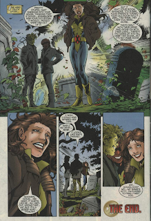
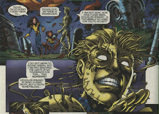
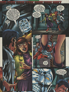
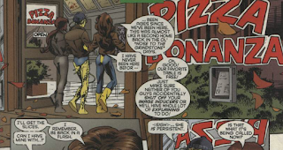
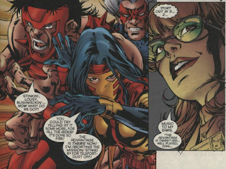
Kitty emerges from Doug Ramsey's grave, stunned to have seen his body. Douglock once again explains that he is not a resurrected Doug Ramsey but, simply, Douglock Wolfsbane accepts this, but Kitty is still not convinced. Meanwhile, on Muir Island, Colossus and Wisdom work together to repel the Mutant Liberation Front's attack, while Dani Moonstar does her best to appear determined to carry out the MLF's mission of retrieving the Xavier Protocols while also sabotaging the mission from within. Back in Westchester, Kitty brings Douglock and Wolfsbane to Kitty & Doug's favorite pizza place. Oblivious to Douglock's protests, she orders Doug's favorite pizza, then is surprised once more when he explains he doesn't like it. Back on Muir Island, Nightcrawler and Moira manage to seal off the computer where the Xavier Protocols are held with a force field, which is enough of an obstacle to give Dani the cover she needs to pull the team out. In Westchester, Kitty, Douglock and Wolfsbane visit Doug Ramsey's childhood home, but when Kitty phases inside and sees that his parents have turned his old room into a den, she realizes they have moved on. This causes her to come to her senses, and she says goodbye to Doug once and for all before formally introducing herself to Douglock.
Firsts and Other Notables
The question of Douglock is, for now, laid to rest, as Kitty finally accepts he is not the resurrected Doug Ramsey, but rather a unique entity who merely adopted Doug's form. This is how the character will be presented going forward, though it is later established that he is in fact a resurrected Warlock, who assumed Doug's form.
The dialogue throughout this issue is distractingly off. Does "I am fast reaching the limits of my tolerance for this... this nonsense!" really sound like how Douglock talks?
Or has Colossus ever said "luck to us all"? Especially the way its presented here, like a thing he's known for saying?
Creator Central
Bryan Hitch pencils this issue, joined by Paul Neary on inks (partially), the creative team that will explode on Wildstorm's Authority and launch The Ultimates in a few years time.
A Work in Progress
When going into the local pizzeria, Kitty tells Wolfsbane and Douglock to make sure their image inducers are on, though Rahne can transform into her human form at this point.
Moira knows Dani is working undercover inside the MLF.
It's in the Mail
The letters page touts Marvel's new AOL platform (and the necessary keyword to find it). It also mentions the beginning of the black-and-white "Essentials" line of reprint collections, and even though I bought this issue and those first Essential volumes, if you'd have told me yesterday the Essentials and marketable AOL use co-existed at the same time, I wouldn't have believed you.
Austin's Analysis
As these things go, this is a mostly fine issue: the plot, in which Excalibur beats back the MLF on Muir Island (with Dani doing her best to lose without blowing her cover) while Kitty comes to terms with the reality of Douglock's existence, works well enough. The art from Bryan Hitch is probably the highlight of the issue, as his larger-than-life widescreen style that will make him a superstar artist is starting to materialize. But where it comes apart is the scripting. Keith Giffen is certainly an accomplished comic book writer, but he clearly knows very little about these characters. As a result, far too many of them sound bizarre speaking Giffen's dialogue. Plus, it's not like this is a quiet, character-focused story where tight dialogue is needed to help carry the issue. Having the characters shout generic action dialogue would have met the needs of the story. Instead, each character, especially in the Muir Island sequences, sounds like they're doing schtick, and it's terribly jarring. The dialogue is so incongruous it immediately pulls readers out of the story, and runs roughshod over its other, far better crafted, elements.
Next Issue
Next week: Nate Grey backs to the AoA in X-Man '96!
It's so odd that Keith Giffen was hired to just do dialogue here. For years, his whole thing was that he did everything (plot, pencils) EXCEPT dialogue. No wonder it's off.
ReplyDeleteGiffen is an odd choice and I can't help but wonder at his inclusion here. Was he being courted as a possible writer for this series? Did Arcudi need a favor? And did Idelson make any changes to suit future plot lines? Probably questions that will never be answered.
ReplyDeleteI did not think I had read this issue before but I have. For some reason I thought this story was before Ellis' run in The Douglocke Chronicles Arc.
I would not have believed that the Essential reprints had been released that long ago. For some reason I thought that they had been a product of the new millenium. Weird.
Yeah, my first thought was that this was too early for Essentials, but after a moment, I changed my mind. I know for a fact that I read ESSENTIAL SPIDER-MAN vol. 1 when I was in high school, and I would've been in my senior year when this issue was published -- so it all checks out.
ReplyDeleteI well remember the "Keyword: Marvel" days, though, and I know that was during high school! I started going to the AOL Marvel forums during "Onslaught".
The publication design of those first Essential volumes was so horrendous — not just aesthetically, but re the infamous wrong-way spine text and lack of page numbers — that it was hard to justify supporting them with my wallet. I did, though, some at least, because it was the only practical way at the time to read certain early Marvel stories and the open line art was useful to scan for B&W publications. While I clearly recall doing just that in my home office at the same desk, same apartment, where I logged onto AOL towards the end — despite having mostly transitioned to CompuServe by then — I definitely relate to that feeling anachronistic.
ReplyDeleteI agree, the initial Essentials looked pretty bad. Those backwards spines drove me nuts, and the graphic design was hideous. I liked some of the new covers the commissioned, though. Bruce Timm did a few random ones.
DeleteI think the only Essentials I read were SPIDER-MAN, AVENGERS, and FANTASTIC FOUR. Of those, I only read AVENGERS vol. 1, then stopped. I read all of FF vol. 1 and got partway into vol. 2 before I gave up on that, too (sorry, Lee & Kirby).
But Spidey, I picked up until the line ended, which I think took us all the way up through the Roger Stern run. To this day, I've only read most of the 100s of AMAZING in black-and-white, though I've since been picking up the Omnibuses that reprint them in color.
I only skipped ESSENTIAL X-MEN because I already owned all that stuff in CLASSIC X-MEN back issues, otherwise it surely would've been on the list.
Beyond all that, I think the only Essentials I ever picked up were IRON FIST, which was "done in one", and TOMB OF DRACULA vol. 1, which I recall I really liked, though for whatever reason I never got the subsequent installments. But Gene Colan's Dracula in black-and-white looked really nice; probably better than with color! (Though I admit I've not read the series in color.)
Oh, I bought LUKE CAGE vol. 1 too, but couldn't really get into it. The great thing about Essentials was that they were a fairly inexpensive way to figure out whether or not you might like an older series.
I liked the Essential design later on, by the way, when they started with the black spines with the actual series logos on them.
DeleteYeah, I definitely remember the Bruce Timm covers to the first Hulk and Uncanny X-Men collections. Why the hell were the “All-New, All-Different” collections titled simply X-Men while the original team, from before the adjective was ever applied to the series, got tagged Uncanny? I think it might even have started with the Masterworks volumes.
The revamped trade dress was so. much. nicer. I dearly wish that actual series logos had been used for the spines of the Epic Collections, instead of ridiculously small plain text.
For whatever reason, Marvel’s Essentials on the whole worked better in B&W for me than DC’s Showcase editions, although to echo what you said with Tomb of Dracula the exception is the likes of House of Mystery, Phantom Stranger, and The Witching Hour. And they really lost me with Showcase editions of stuff I had bought off the racks like Batman and the Outsiders.
If I recall, the original run of X-Men collected in the Essential volumes were ran as "Classic X-Men" rather than "Uncanny". Though I might be wrong. It's been awhile.
DeleteAs far as I remember, it was always "Uncanny", but I could also be mistaken.
DeleteTo Blam's point -- dividing the two lines as X-MEN and UNCANNY X-MEN did indeed originate with the Masterworks, but there it was the reverse! They started the X-Men Masterworks line with the Silver Age stuff under the name MARVEL MASTERWORKS: THE X-MEN, but after two volumes they weren't selling that great, so they relaunched that series as MARVEL MASTERWORKS: THE UNCANNY X-MEN, with the "All-New, All-Different" issues.
Doing it that way makes way more sense, even though "The Uncanny" wasn't officially added to the series title until 1980 or whenever. The covers started to use that descriptor, off and on, much earlier during the new team's run.
I just checked, the Essential Collections of the Silver Age X-Men were indeed published as "Classic X-Men". Which is even a stranger choice than Uncanny, as Classic X-Men makes me think of that series.
DeleteThey were Uncanny to start. I have a first printing of Essential Uncanny X-Men Vol. 1 with the cover shown on the GCD’s master page for that series, which notes that it continues as Essential Classic X-Men with the next book.
Delete
DeleteI’m fine with the “All-New” era being labeled Uncanny, Matt. To be honest my question was as rhetorical as it was peevish because I think I know why Uncanny X-Men got used for the O5 Essential (if only for Vol. 1, as it seems): When the second, adjectiveless X-Men series came along in 1991, the original series got retroactively, forevermore labeled Uncanny X-Men in its entirety to differentiate it, so the Essential just ran with that. I don’t like hearing/seeing people refer to what I would call say, X-Men Vol. 1 #17 or X-Men [1st series] #17 as “Uncanny X-Men #17” — but I understand.
Now, with so many relaunches having taken place, this millennium’s convention seems to be to use the start year of a series after its name when necessary, i.e. “X-Men (1963) #17”.
I don't understand why Marvel stopped indicating year of publication on their covers or the "Volume" indicator in the indicia. Either of those things would be helpful for modern collectors if they're going to insist on relaunching every 40 issues or so.
Delete@Drew: I get (sort of) why Marvel switched to designating their volumes by the year they launched, especially on Marvel Unlimited. But it makes zero sense to not reflect that in the indicia as well (whether by year or volume number) so nerds like us can keep track of stuff better.
DeleteNow who remembers Backpack Marvels…?
ReplyDeleteI remember the Backpack Marvels books! I browsed the Avengers NIGHTS OF WUNDAGORE volume at the local comic shop, but for whatever reason, I didn't buy it.
DeleteMy main recollection is that they had painted covers, I think by the Hildebrandt brothers, but it might've been Joe Jusko (or maybe even both on different books)?
This comment has been removed by the author.
ReplyDeleteI think this one was better than 104 - at least the dialogue was more than loads of exposition like last issue.
ReplyDelete